
How to Read Candlestick Charts
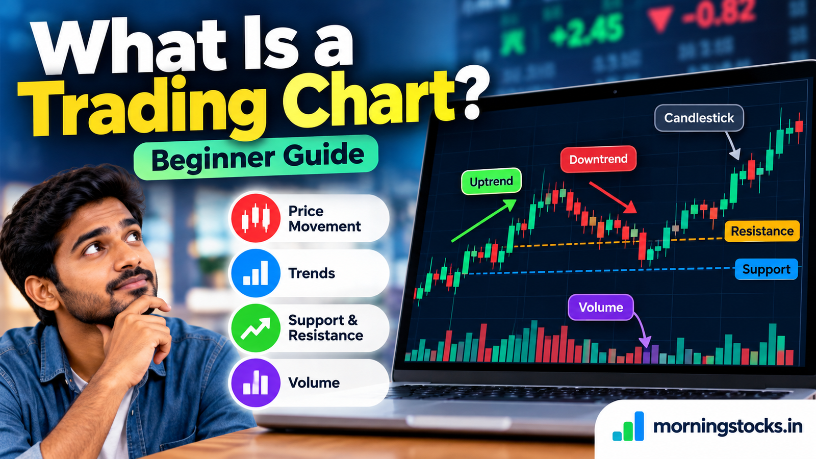
How to read candlestick charts is the single most important chart skill you’ll build in this entire series. In our last lesson, we learned what a trading chart is and why candlestick charts are the standard tool used by professional traders. Now it’s time to understand exactly how a single candle works, because once you can read one candle, you can read any chart.
Table of Contents
- What Is a Candlestick?
- The Four Prices in Every Candle (OHLC)
- Anatomy of a Candlestick: Body and Wicks
- Bullish vs Bearish Candles
- What the Body and Wick Sizes Tell You
- Reading a Candle as a Story
- Common Beginner Mistakes
- Frequently Asked Questions
1. What Is a Candlestick? How to Read Candlestick Charts Starts Here

A candlestick is a single visual unit on a chart that summarizes everything that happened to a stock’s price during one specific time period — whether that’s one minute, one hour, one day, or one week. Each candle packs four important pieces of price information into a single, easy-to-read shape.
Candlestick charts originated in Japan centuries ago, where rice traders used them to track price movements. Today, they are used by traders worldwide for stocks, currencies, commodities, and more.
2. The Four Prices in Every Candle (OHLC)

Every candlestick is built from four price points, collectively called OHLC:
- Open (O) — the price at which trading began during that time period
- High (H) — the highest price reached during that time period
- Low (L) — the lowest price reached during that time period
- Close (C) — the price at which trading ended during that time period
If you’re looking at a daily candle, these four numbers describe the entire trading day: where the stock opened in the morning, how high and low it went, and where it closed at 3:30 PM.
3. Anatomy of a Candlestick: Body and Wicks

A candle has two main visual parts:
- The Body — the thick, rectangular part of the candle, showing the range between the open and close prices
- The Wicks (also called Shadows or Tails) — the thin lines above and below the body, showing the highest and lowest prices reached during that period
The upper wick extends from the top of the body to the period’s high. The lower wick extends from the bottom of the body to the period’s low.
4. Bullish vs Bearish Candles

The color of a candle tells you at a glance whether buyers or sellers won during that time period:
- Bullish Candle (usually green or white): The close is higher than the open. Buyers were stronger — the price moved up during that period.
- Bearish Candle (usually red or black): The close is lower than the open. Sellers were stronger — the price moved down during that period.
For a bullish candle, the bottom of the body is the open and the top of the body is the close. For a bearish candle, it’s reversed — the top of the body is the open, and the bottom is the close.
5. What the Body and Wick Sizes Tell You

Beyond color, the size of the body and wicks reveals a lot about market behavior:
- Large body — strong conviction; buyers or sellers dominated with little resistance
- Small body — indecision; neither side was clearly in control
- Long upper wick — price pushed higher but sellers pushed it back down before the close
- Long lower wick — price fell but buyers pushed it back up before the close
Pro Tip: Don’t just look at whether a candle is green or red. Ask: “How far did price travel, and where did it end up relative to that range?” A long wick with a small body often tells a more interesting story than a large, plain candle.
6. How to Read Candlestick Charts as a Story

Every candle is a tiny story of a battle. Imagine a daily candle where the stock opened at ₹100, dropped to ₹95 (the low), then rallied strongly to ₹108 (the high), and finally closed at ₹106. This candle would be green (close above open), with a long lower wick showing the early selling pressure that buyers overcame, and a short upper wick showing sellers pushed price slightly down from the high before the close.
That single candle tells you: sellers tried early, buyers overwhelmed them, and buyers ended the session in control. Once you learn to read candles this way, a chart stops being a confusing mess and becomes a readable narrative.
7. Common Beginner Mistakes

- Assuming a green candle always means the price will keep rising — a single candle only describes what already happened
- Ignoring wicks and looking only at the body
- Reading candles in isolation instead of seeing them in the context of the surrounding candles (we’ll cover this as we build toward candlestick patterns and price action)
- Forgetting to check which timeframe the candle represents — a green 5-minute candle and a green daily candle tell very different stories
8. Frequently Asked Questions
What do the colors of candlesticks mean?
By default, green (or white) usually means the close was higher than the open (bullish), and red (or black) means the close was lower than the open (bearish). You can usually customize these colors in your charting platform.
What is the difference between a candle’s body and wick?
The body shows the range between the open and close prices; the wicks show the extreme high and low prices reached during that period.
Does a long wick mean anything important?
Yes — long wicks show that price was rejected at certain levels. A long upper wick suggests sellers pushed price back down; a long lower wick suggests buyers pushed it back up. This becomes very important later in price action trading.
Can I read candlestick charts on any timeframe?
Yes, candlesticks work on any timeframe — from 1-minute to monthly charts. The interpretation principles are the same, though the significance changes depending on the timeframe.
What should I learn next?
Now that you understand how a single candle works, it’s time to learn about the different timeframes you can view them on — and why choosing the right one matters.
Read “What Are Timeframes in Trading?” to learn how zooming in and out on a chart changes what you see.
This article is for educational purposes only and does not constitute investment or trading advice. Please read our full Disclaimer before making any trading decisions.